Just the right amount of wrong.
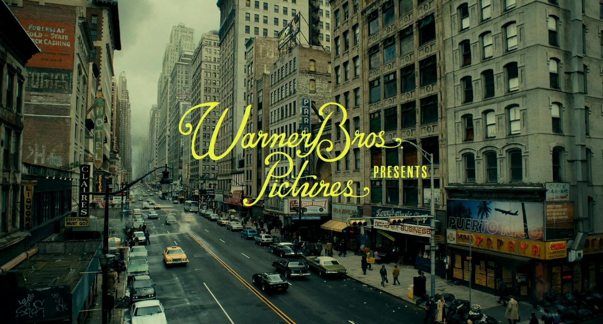
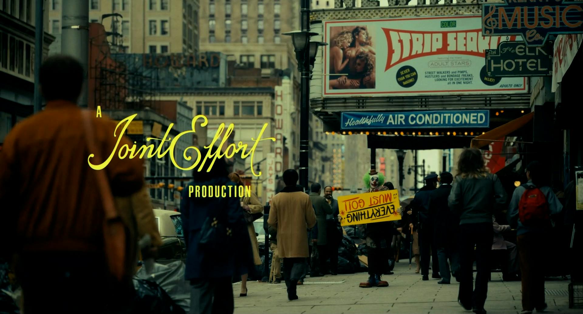
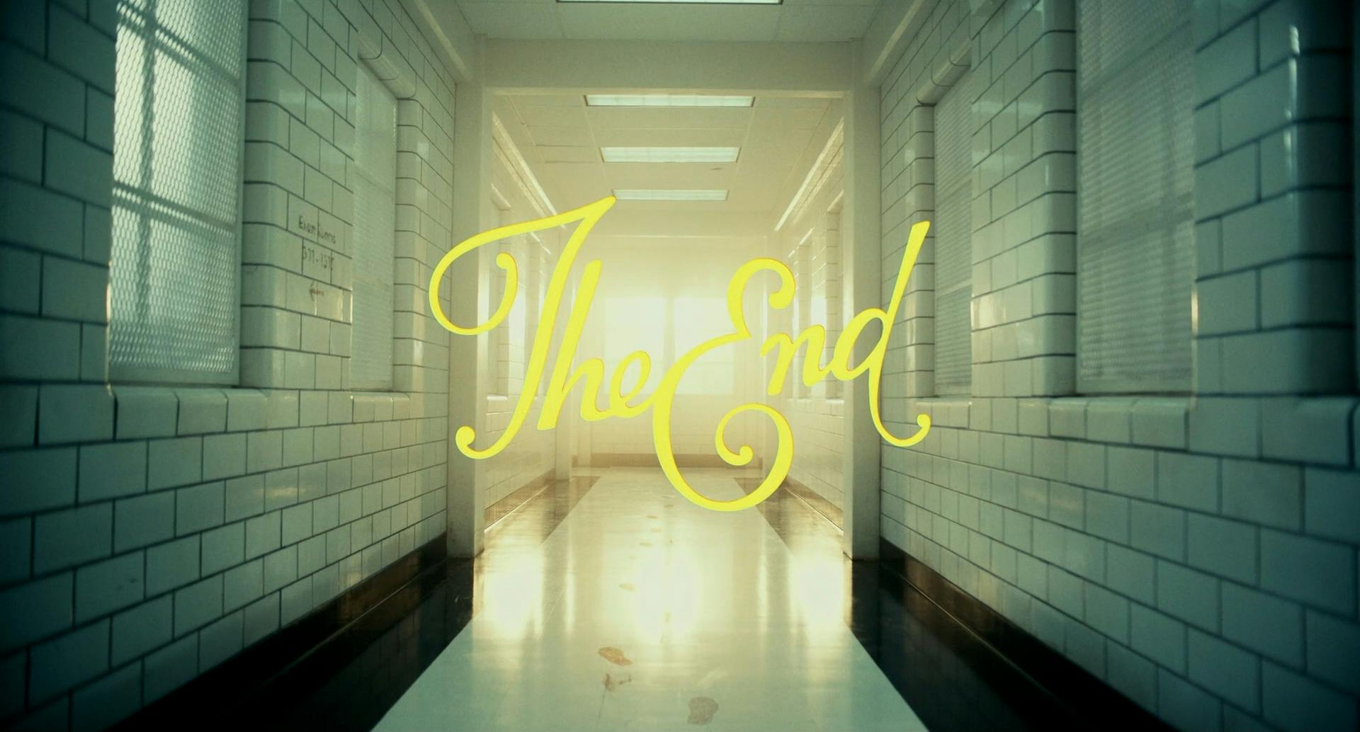
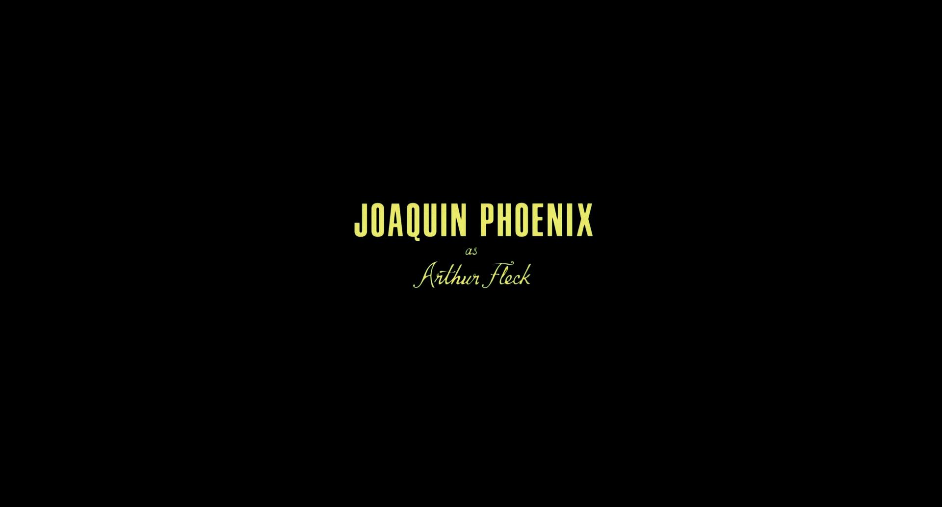
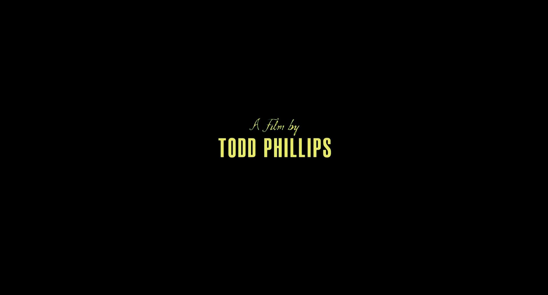
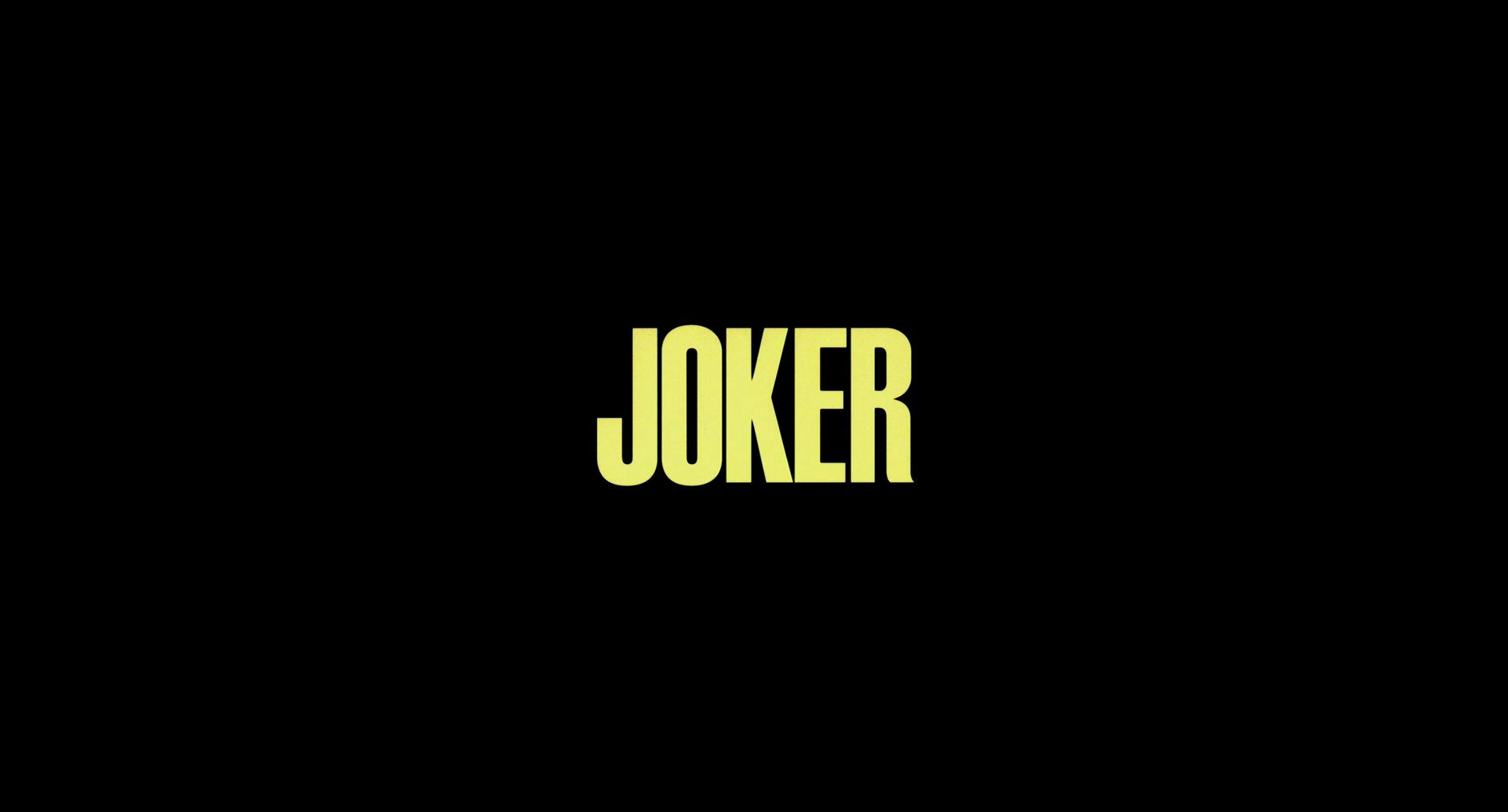
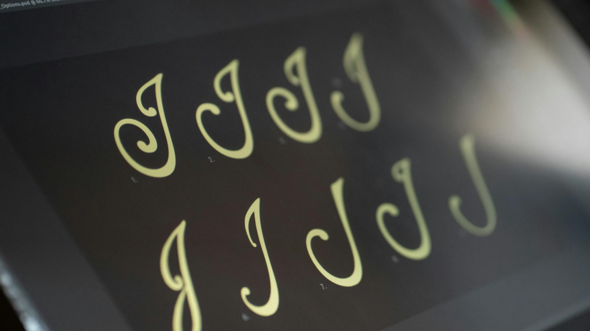
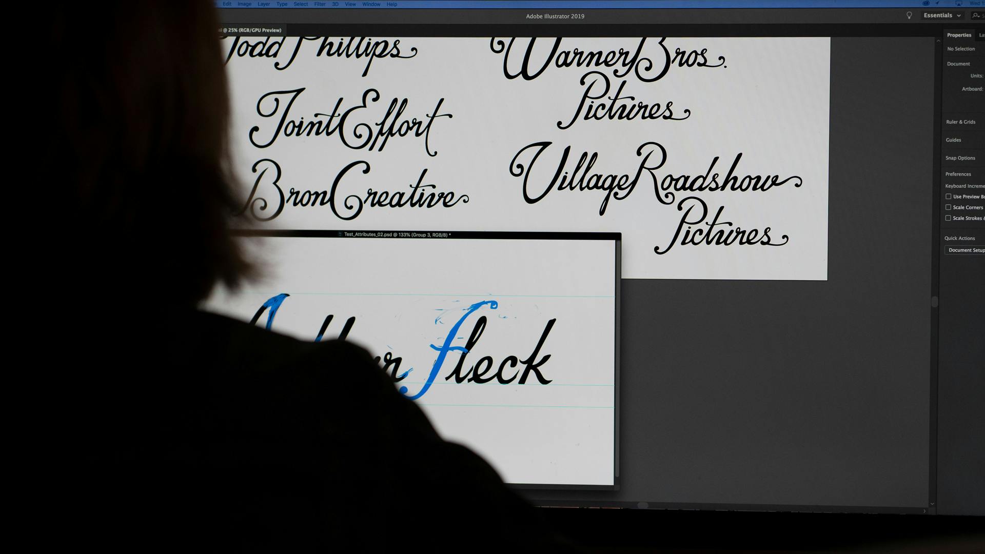
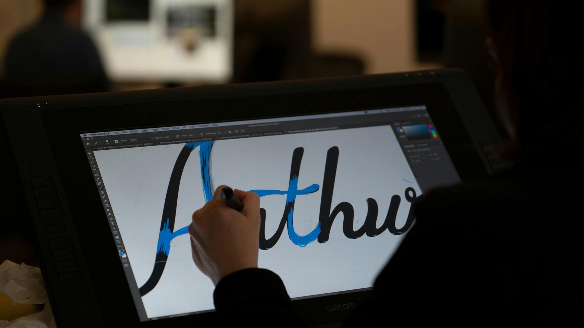
Set in 1981 and inspired by classic films such as Taxi Driver and The King of Comedy, the tone of the Joker titles is vintage and nostalgic, even the Warner Bros. Pictures logo was a variation of its mid-70s Saul Bass design. It began at the end (literally), with the design of the “The End” card laid over the final scene of the film, which inspired the direction for the rest of the project. We created a custom typeface with our in-house illustrator, which was used for the rest of the titles.
Jeff Groth, the editor of the film, described the process as follows:
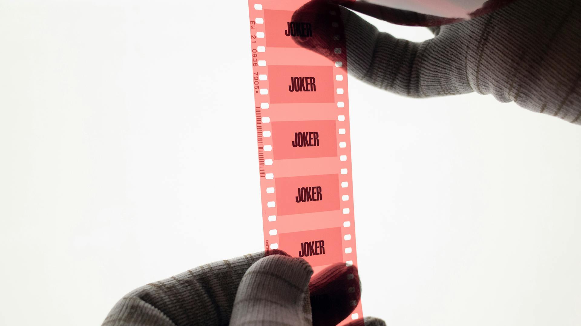
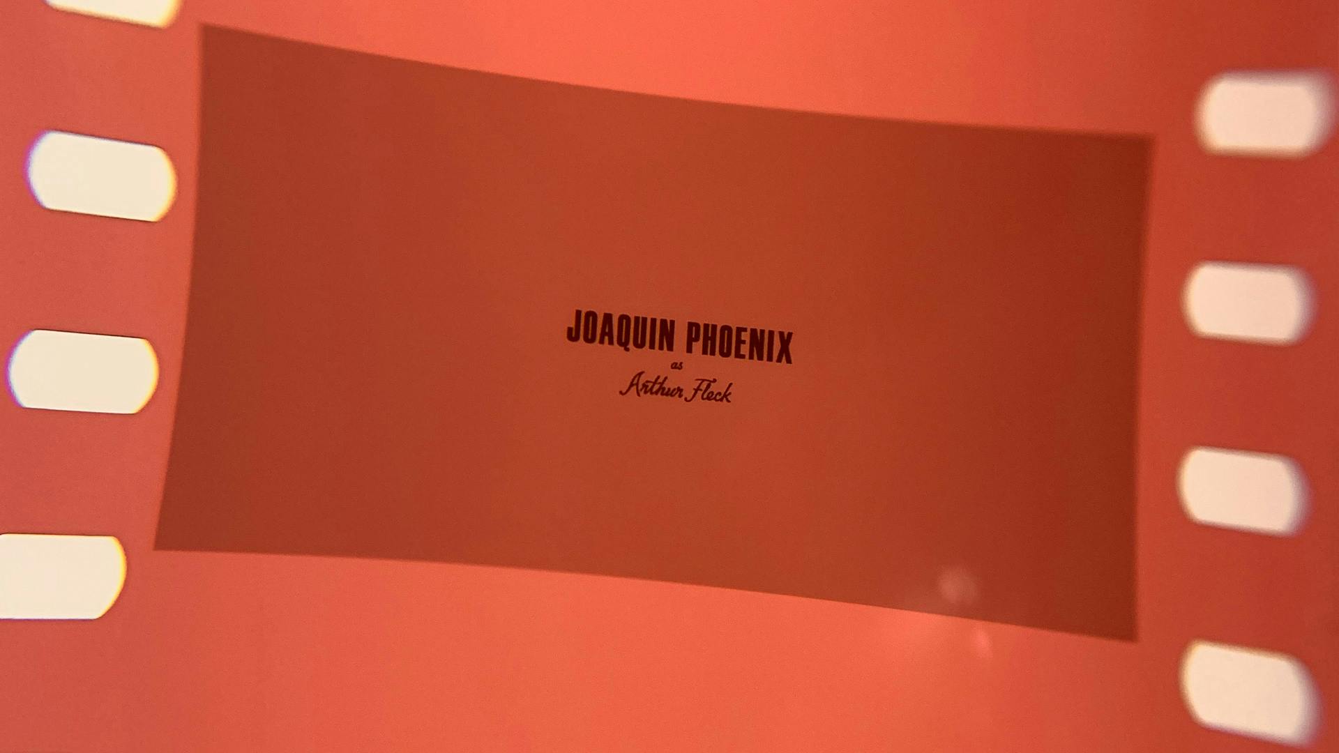
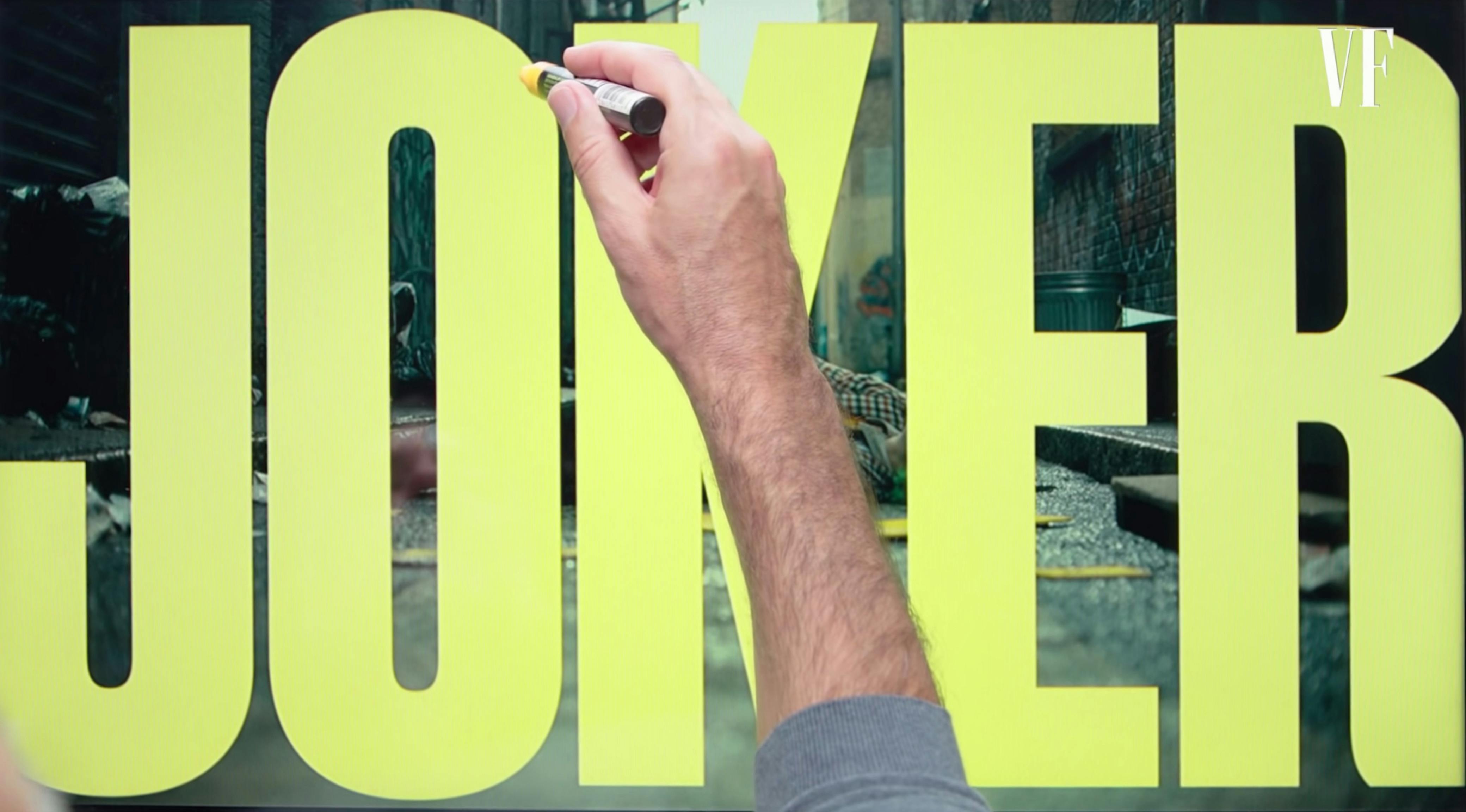
“If you look at the titles, they have got a very kind of specific yellow that feels like it reaches back to that time a bit. What we did with those is to actually put them on film, and then scan them back in so that they don’t have a digital edge. And they kind of have this little bit of color bleed that you would get from optical printing titles, which they just don’t do anymore.” (Katherine Brodsky, “How ‘Joker’ Editor Jeff Groth Helped Transform Arthur Fleck”, Variety, January 3, 2020)
Technically-speaking, the task was to match the look and feel of film titles in the '70s and '80s without being disingenuous. That meant that we couldn't add dust and scratches, or any forced imperfections that might signify “old film titles”, but rather that we put ourselves in the shoes of an imaginary title designer in the past. As if we were an artist trying to get the cleanest, most elegant titles on film using the technology of the time.
Creatively, however, we asked ourselves what these titles would look like if the title designer in the late '70s was aiming for the look and feel of the classic paint on glass titles of the '40s. (We also looked at a lot of Frank Sinatra album covers.)
